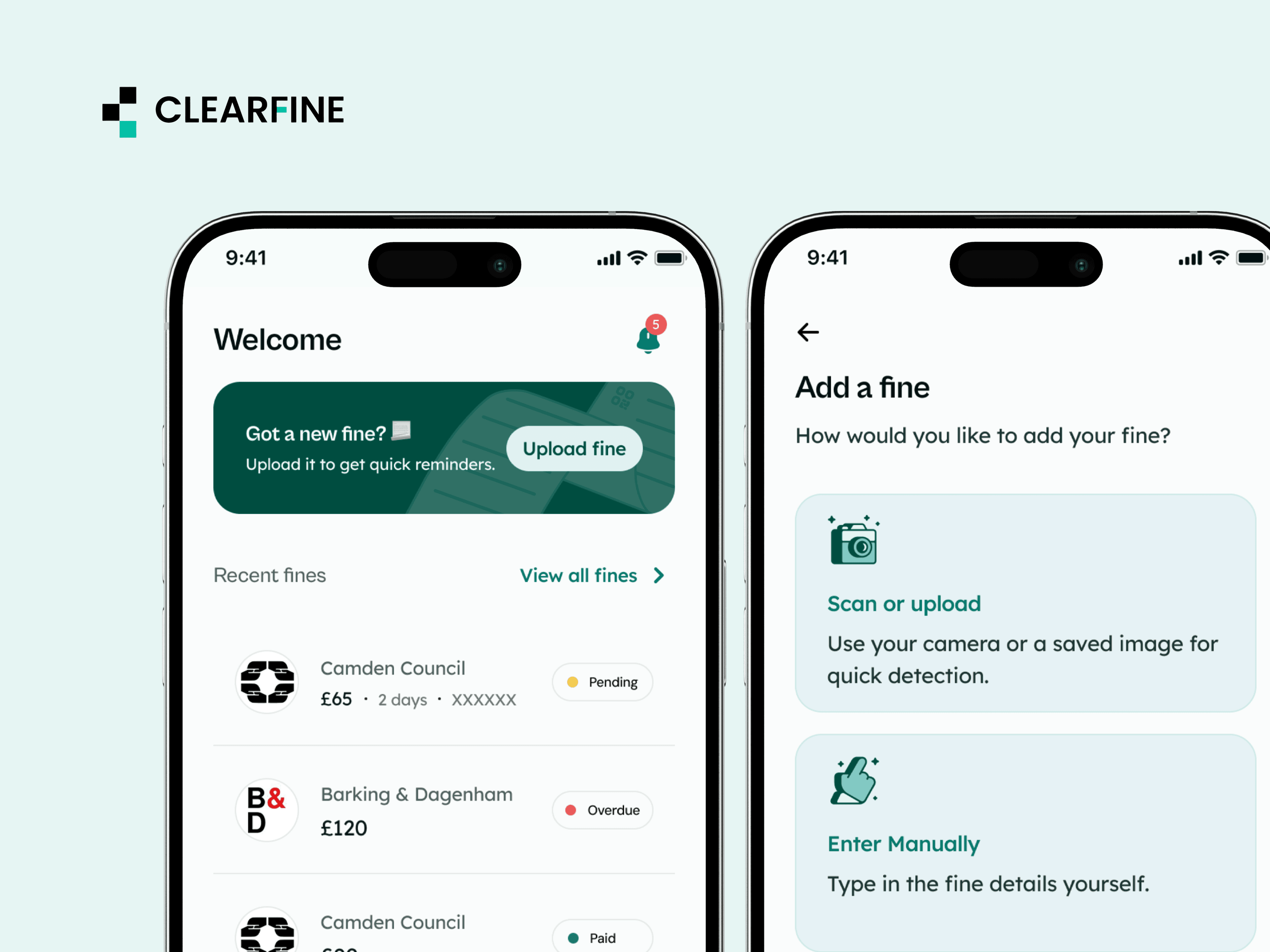
Clearfine is a mobile app that helps UK drivers keep parking fines, road charges, and payment deadlines in one place. I designed the app end to end, from onboarding to subscriptions. It's now live on the App Store.
- Role
- Product Designer (sole designer)
- Team
- Product Manager, developers
- Timeline
- 2 months
- Platform
- iOS
- Focus
- Product design, UX, interaction design, UX writing
01The problem
Fines are easy to lose track of.
Notices arrive on windscreens or through the post. Deadlines sit in one place, payment links in another, and most drivers rely on memory or calendar reminders to keep track. Miss a deadline, and a fine can become more expensive.
Managing fines gets even messier when you're dealing with multiple cars, rental vehicles, or a company vehicle.
The challenge was to help drivers organise their charges, keep track of deadlines, and know what to do next.
02Discovery
The problem wasn't just remembering. It was keeping everything together.
I spoke with users to understand how they managed parking fines and road charges, the challenges they faced keeping track of deadlines, and how they handled payments.
I also reviewed official UK payment guidance and existing parking apps to understand the payment process and what solutions were already available.
I looked at the process from the driver's perspective: identifying who issued a fine, understanding the amount and deadline, keeping track of outstanding charges, and finding the right place to pay.
Three things stood out:
- The process was fragmented. Fine details, payment instructions, and deadlines weren't always easy to manage in one place.
- Missing a deadline could be costly. Drivers needed to know when to pay to avoid losing an early-payment discount or incurring additional charges.
- Existing solutions addressed parts of the problem. Features like scanning and reminders were useful, but there was an opportunity to bring fine tracking, vehicle management, deadlines, and payment access together.
These findings shaped three priorities for Clearfine:
- Make fine entry quick. Reduce the effort involved in adding a fine.
- Make deadlines easy to spot. Help drivers understand what needs attention and when.
- Make the next step clear. Guide users from recording a fine to tracking it and accessing the relevant payment portal.
Rather than simply digitising fine notices, I wanted to create a connected experience that helped drivers stay organised without having to remember every detail themselves.
How drivers handle fines today
- 01Notice arrives (windscreen or post)
- 02Work out who issued it
Different issuers, different rules
- 03Find the deadline and discount window
Miss the discount window and it can cost more
- 04Try to remember it
- 05Find the right council’s payment site
Every council has its own site
- 06Pay
03Design decisions
Onboarding that fits the driver
Not every driver has the same setup. Some have one personal car, while others manage multiple vehicles, rentals, or company cars.
Rather than assume everyone would use the app in the same way, I designed onboarding around a few questions about how people drive and how they currently manage fines. Their answers help shape the experience around their needs.
Scan, don't type
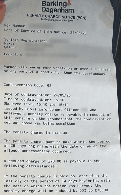
Typing out fine details is tedious and leaves room for errors. I designed an OCR scanning flow that extracts information from a photo of the notice, reducing the amount users have to enter manually.
Users can review and edit the extracted details before saving. Manual entry is also available depending on the user's preference.
Show what needs attention first
A list of fines is only useful if drivers can tell which ones need attention.
The dashboard displays fine amounts, due dates, and clear statuses: Upcoming, Paid, and Overdue. This helps users understand where things stand without opening each fine individually.
Reminders that fit your routine
Users shouldn't have to open the app just to stay on top of their fines.
I designed reminders across push notifications, SMS, email, and calendar integrations, so users can receive updates through channels they already use.
Convert without catching people off guard
Clearfine Premium starts with a two-month free trial. Rather than putting a paywall in front of users immediately, I placed it after they've had an opportunity to experience the core features.
The trial messaging clearly explains the offer, and users receive a heads-up before it ends. The aim is to make the transition to a paid subscription clear, without unexpected charges.
04The solution
One flow, from fine to paid.
I brought the core experience together into a single journey, guiding users from adding a vehicle to keeping track of fines and accessing the relevant payment portal.
- 01
Add a vehicle
Users add their vehicle details so Clearfine can organise the information associated with it.
- 02
Scan or enter a fine
Users can scan a notice to extract its details or enter the information manually.
- 03
Review
Users can check the fine details, including the amount and deadline, before saving them.
- 04
Track
Fines appear alongside their statuses and due dates, making it easier to see what has been paid and what still needs attention.
- 05
Get reminded
Notifications and reminders help users keep upcoming deadlines in view.
- 06
Pay on the council's portal
When it's time to pay, users can proceed to the relevant council website. Clearfine explains what happens when they leave the app, so the transition doesn't feel unexpected.
Each step leads into the next, with clear statuses, helpful error messages, and straightforward explanations throughout the journey.
05Impact
From the first screen to App Store.
As the sole designer, I took Clearfine from idea to launch in two months, designing 80+ screens across onboarding, fine scanning, tracking, reminders, and subscriptions.
The app is now live on the App Store.
With the product live, we're tracking the metrics that matter most to the experience:
- Scan completion
- Reminder adoption
- On-time payments
- Trial-to-paid conversion
These metrics will help us understand how users engage with the core features and where the experience can improve.
06Reflection
Design the journey, not just the screens.
Clearfine reinforced something I value in product design: a useful product helps people understand what they have, what needs attention, and what to do next.
The goal throughout was simple: help drivers remember less and feel more in control.
What I'd do differently: keep it simple as it grows.
With scanning, vehicle management, reminders, and payments in one app, every new feature needs to earn its place. In future iterations, I'd continue evaluating how each feature fits into the user's journey and remove steps that don't need to be there.