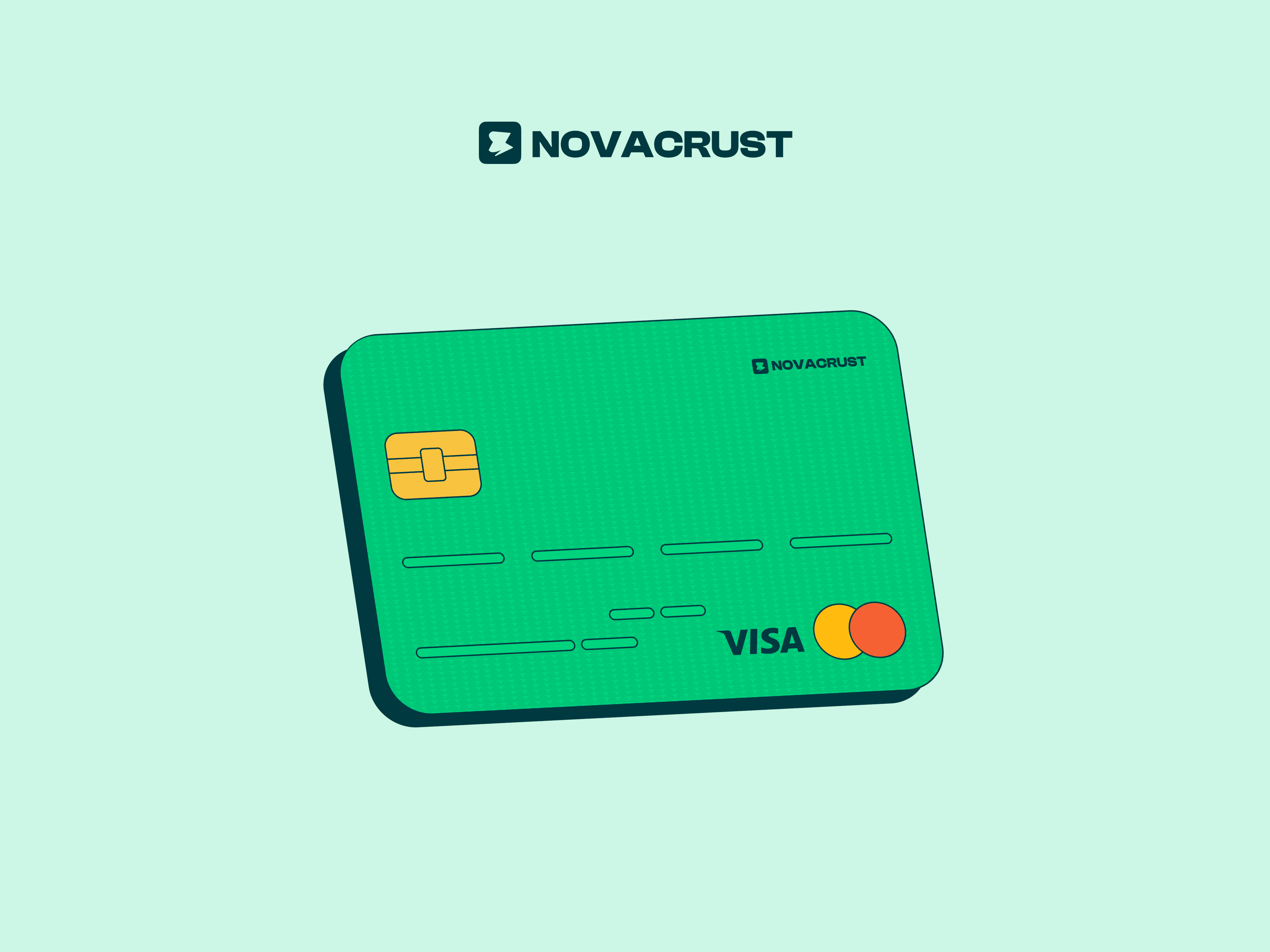
Novacrust is a virtual card and cross-border payment platform for African freelancers, creators, and remote workers. Users can fund a wallet, exchange naira for dollars, and pay for global tools with a virtual card.
I designed the experience across mobile and web, from onboarding to everyday transactions. The product is now live.
- Role
- Product Designer
- Team
- Product Manager, developers
- Timeline
- 2 months
- Platform
- Mobile app, responsive web
- Focus
- Product design, UX/UI, visual design
01The problem
Paying for global tools shouldn't be hard.
For African freelancers, creators, and remote workers, tools like Adobe, cloud services, and domain providers are part of the job. But traditional banking can make cross-border payments slow, expensive, and unreliable.
This makes it harder to pay for essential subscriptions, receive payments from global clients, and participate fully in the digital economy.
02Discovery
Understanding the people behind the problem.
I spoke with users to understand their experiences with cross-border payments, the challenges they faced when paying for global tools, and what they needed from a virtual card platform.
Alongside market analysis, these conversations helped us identify five recurring pain points:
- Painful KYC. Long forms, confusing steps, and failed verifications made it difficult for users to get started.
- Limited spending options. Many users struggled to find virtual cards that worked reliably for their tools and subscriptions.
- Tricky card funding. Some platforms supported only certain currencies, making it harder to fund a card.
- Hidden fees. Unexpected charges, poor exchange rates, and unclear pricing left users unsure of what they were paying.
- Low trust. Previous experiences with lost money and failed card payments made users wary of trying another platform.
These findings informed our approach to designing for freelancers receiving payments from global clients, remote workers paying for software, creatives using tools like Adobe, entrepreneurs, and anyone paying for subscriptions such as Netflix or Spotify.
03Working from the PRD
Turning system requirements into a usable experience.
When I joined Novacrust, the brand identity and a detailed product requirements document (PRD) were already in place. The PRD covered the planned features, compliance requirements, and technical limitations.
My role was to translate those requirements into an experience people could understand and trust, while identifying gaps that needed attention.
I focused on three things:
- Separating what users needed to see and do from what the system handled behind the scenes.
- Identifying the moments where trust mattered most: KYC, card funding, and withdrawals.
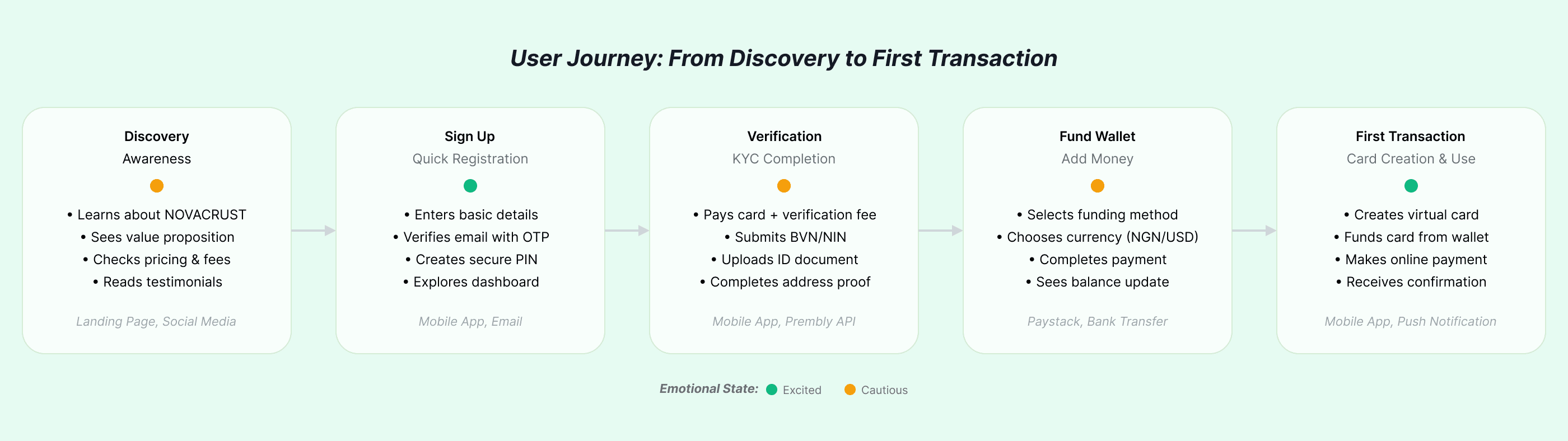
- Mapping the journey from a user's first visit to their first transaction.
These became the three questions that guided my design decisions:
- How might we simplify KYC without compromising compliance?
- How might we help users feel in control of their money at every step?
- How might we reduce uncertainty around fees, exchange rates, and failed payments?
04Design decisions
I translated the PRD's user stories into end-to-end flows, thinking about how each step would feel to the user, not just what they needed to tap.
I also reviewed the flows with the product manager and developers early in the process, before moving into high-fidelity designs. This helped us address gaps and align on the intended experience before implementation.
KYC as a step-by-step journey
Instead of presenting users with one long form, I broke verification into smaller steps.
This made the process easier to follow and helped users understand what information was needed at each stage, while keeping the required verification checks in place.
Show the cost before commitment
I designed the card creation and funding flows to show a full cost breakdown upfront, so users could understand the charges before proceeding.
Each transaction also has a receipt showing the amount, fee, status, and reference, giving users a clear record of what happened.
A wallet that shows where money goes
The home screen brings account balances, cards, and recent transactions together in one place.
Users can see where their money is held, where it's going, and what transactions cost. For new users, a clear prompt encourages them to create their first virtual card.
Card controls
I kept key actions close to the card itself. Users can fund their cards, withdraw money, and access card details from the card screen, while currency exchange is just one tap away.
The goal was to make everyday money management straightforward without forcing users to navigate through multiple screens to find common actions.
05Bringing the card to life
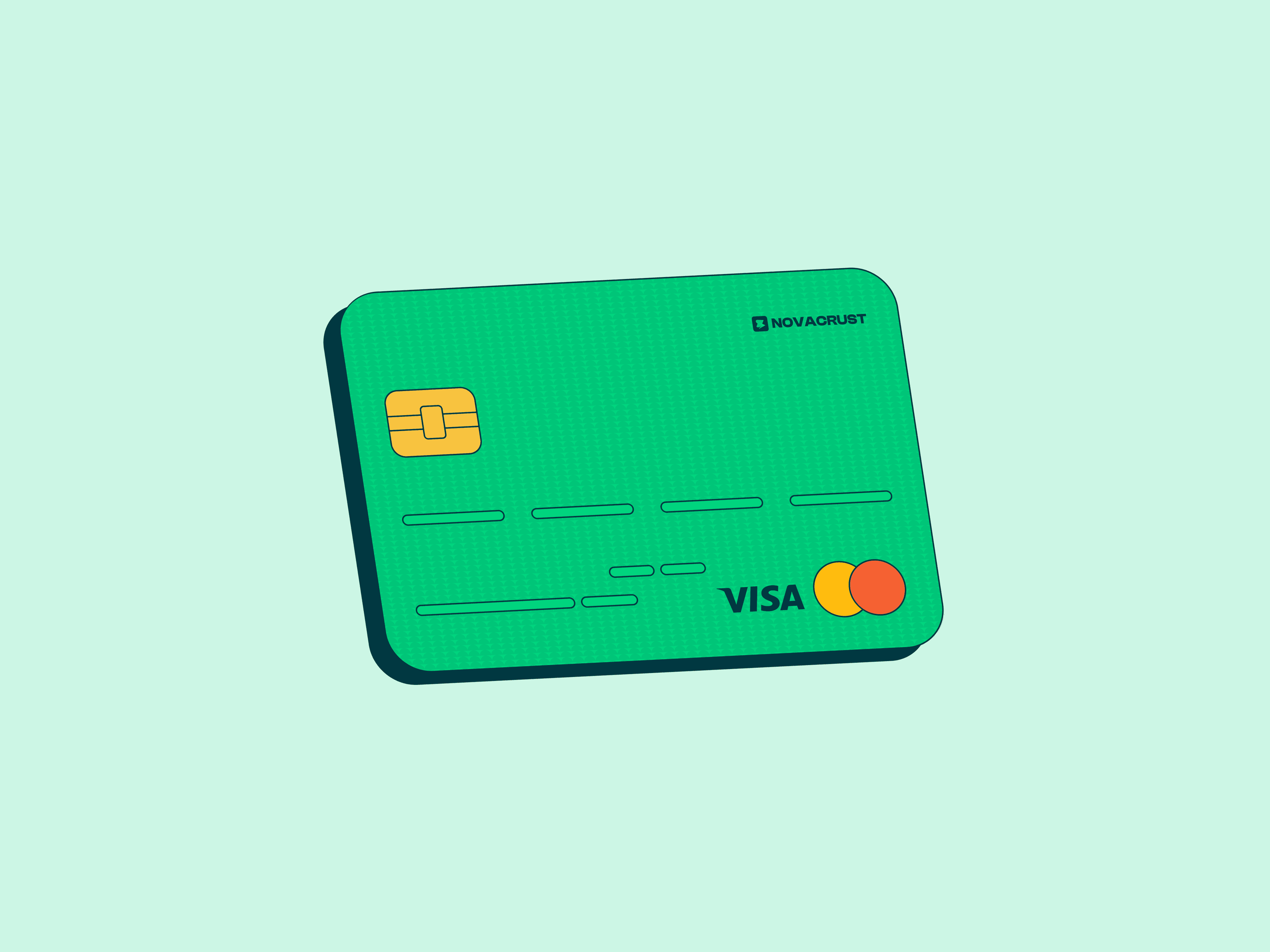
The virtual card needed a visual identity of its own. It's one of the most visible parts of the product, so I wanted it to feel recognisable and consistent wherever users encountered it.
Working within Novacrust's existing brand identity, I designed a bold green card with a gold chip for use across the website, onboarding, and app. I also created darker card variations for use within the app interface.
This gave the card a consistent presence across the product while keeping it visually connected to the wider brand.
06Final designs
The final designs brought the onboarding, verification, wallet, card management, and transaction flows together into one experience.
Across the screens, I focused on reducing friction, keeping financial information visible, and making each step clear. From creating an account and setting up a card to funding a wallet and reviewing a transaction, the interface was designed to make cross-border payments feel easier to navigate.
07Impact
From PRD to a live product.
Novacrust is live, built on the flows and design foundations established during this project.
Working through the flows with the product manager and developers early helped keep implementation aligned with the intended experience and reduced surprises during the build.
Since then, Novacrust has grown to 10,000+ users.
08Reflection
Good design works within real constraints.
Working with an existing brand identity and a detailed PRD taught me to focus on what mattered most: usability, trust, and simplicity.
Collaborating closely with the product manager and developers helped me keep design decisions practical and aligned with the product's requirements.
Most importantly, the project strengthened my ability to turn complex requirements into experiences that are straightforward to use.